
7 Tips for Choosing the Right Paint Color for Your Home
Painting is a cheap and fairly easy way to liven up your home and give it some character. But painting isn’t simply thinking about your favorite color and proceeding to brush away. Follow these seven tips to avoid do-overs and make sure you have wonderful walls in your home.
Match paint with furniture
If you already have furniture and other prominent home accents, you can use them as the base for your wall paint and follow the “Rule of 3 Colors”, which is simply that the best color palettes are a mix of one dominant color (your wall paint) and two complementary colors (furniture and accents). A yellow shade, for example, would match well with a navy blue sofa and some stylish green house plants.
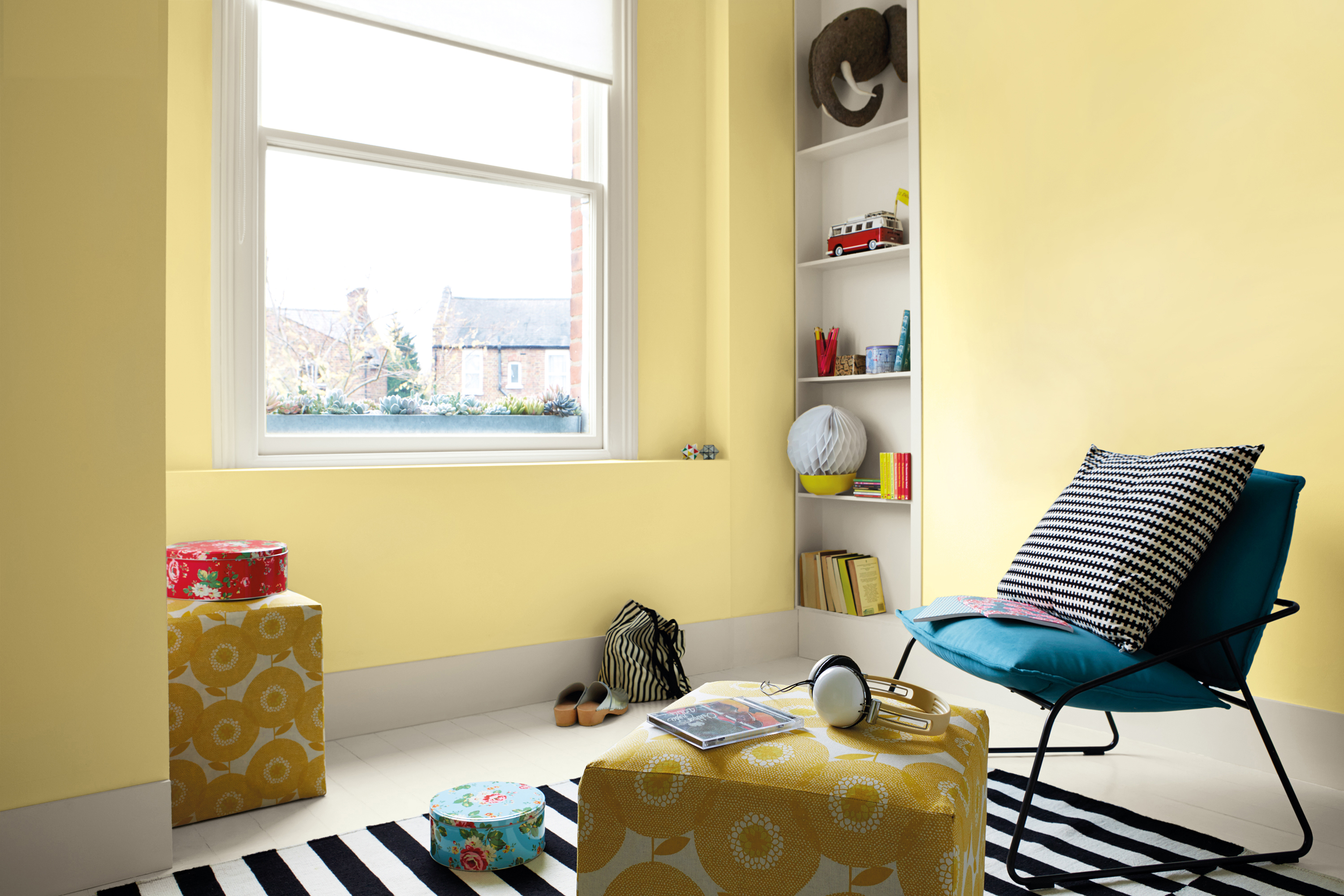
Choose neutral colors
Your choice of neutral colors isn’t just limited to white or beige. Rose pink, powder blue and light grey, among much else, would serve just as well. Neutral colors have three advantages: they naturally look elegant, they can be easily customized, and they make the room look more spacious. Just add highlights, such as trims and borders, to avoid making your room look too plain.
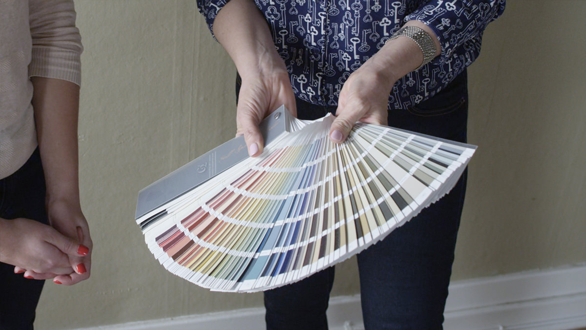
Explore different shades
It could happen that you’re halfway painting a wall when you realize the color you chose isn’t really what you had in mind. (This is quite common since a sample plate looks much different from a fully painted wall.) However, instead of doing over, try first to make the paint a bit lighter or darker – it might all just be a matter of shades.
Have a cohesive element
If you want different paint colors for each part of your house – the living room, bedrooms, kitchen and dining area – make sure that your home still has a unified look by using a single color accent for your trims, millwork, door frames and window frames. Explore both bold and subdued colors and shades for this one.
Use the psychology of color
Unsure what to color a room? Use color psychology. For the kitchen, the best color is yellow as it energizes the room. Red is for the dining room as it increases appetite (use blue, though, if you want to diet). Blue or green are for home offices as these colors boost productivity. Lastly, white or green are best for bedrooms as they promote tranquility.
Dynamic or relaxing?
Is the room you’re painting a place for relaxation or for play? For the former, use analogous colors (colors that are close to each other in the color wheel) such as green and blue. If it’s the latter, use contrasting colors, such as blue and orange, to create dynamism.
Don’t forget about sheen quality
Painting with a high sheen, such as semi- or high-gloss, will make the color look a bit darker and more likely to show any imperfections in your wall, but create a dramatic and formal look ideal for the living room or dining room. A low sheen or matte finish gives a velvety, soft gloss that make a space feel lighter, making it best for entrances, hallways and bedroom.